
 iSoaker.com Icon Updates .:
Over the past few days, as part of the reorganization and rebuilding of iSoaker.com, I opted to roll out some new icons that I have been developing for a little while.
Brief History of iSoaker.com Icons
The icons on iSoaker.com actually existed before iSoaker.com did. As some may know, iSoaker.com was previously called Aquatechnology back in the late-1990s and start of 2000.
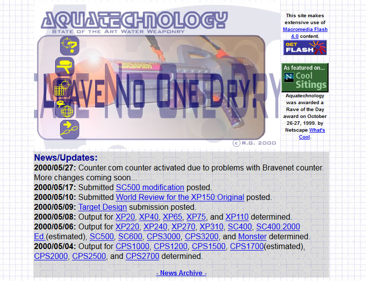
Aquatechnology's Landing Page at the end of May, 2000
Having run Aquatechnology for more than a year and a half, I was excited by the growing online water warfare community and definitely enjoyed learning and updating my web developer skills as well. As new web technologies like Macromedia Flash became available, I dove in, eager to try to take advantage of the latest technology to present my favourite hobby, water warfare, to others seeking advice or had interest in learning more about water blasters. It was in the year 2000 that I had the idea of adding icons to Aquatechnology to make the pages on different sections easier to recognize and to unify the look of pages across the site.

Aquatechnology's Initial Icon Set
Five icons were introduced for the major types of pages on Aquatechnology: Info, The Armoury, Tips & Tactics, Soaker World, and Links. These icons were designed using Macromedia Flash and could be exported into JPG and PNG as needed, but the early navigation on Aquatechnology made heavy use of Flash. As such, the icons were usually embedded within Flash files which also allowed to early web UI elements such as rollover effects and sounds.
From Aquatechnology to iSoaker.com
As the internet was still young then, but as I had decided to become committed to maintaining a website on water blasters, I wanted to acquire a domain name for my website. However, "aquatechnology.com" was already taken, so I considered some other potential names. Being the time when "i-" tended to signify anything Internet-related, I ended up registering iSoaker.com. iSoaker.com was launched on June 8, 2000.
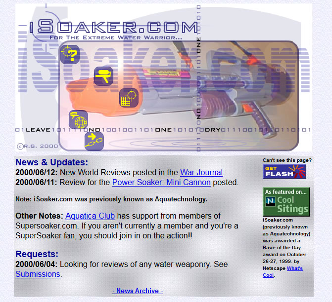
iSoaker.com Initial Landing Page
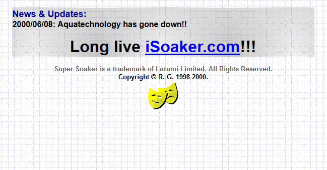
Aquatechnology's Redirection Page
Not only had I acquired the iSoaker.com domain name, but iSoaker.com now lived on a dedicated shared hosting service for it (as opposed to Aquatechnology that lived on a free hosting space provided by my Internet Service Provider at the time). The icons from Aquatechnology remained the same for familiarity sake (and since I had just opted to make the plug barely a few weeks prior to launch).
Icons on iSoaker.com from 2000 to 2013
As iSoaker.com grew and developed, so did the style and number of icons used to represent different sections or link-types throughout the site. In fact, in my offline icon resource file, the number of icons grew to over 30 types.
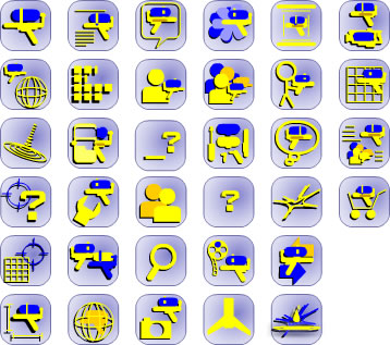
iSoaker.com Icons (2013)
Not all icons were in use at any one given period, but all were kept in the offline file for reference and, of course, just in case I opted to relaunch an old project or recycle an old icon for a new endeavor. Since each icon did take time to design, if I could re-use old ones or use them as templates for new needs, this would definitely save time going forward. Compared to the original Aquatechnology icons, the latter iSoaker.com icons feature a minor drop-shadow that helps highlight the icons on different backgrounds. Besides the shared light blue-gradient background, the icon colour palette was initially meant to be limited to yellow and blue, but two other colors were sometimes included (a darker orange-yellow and a light-blue colour) on some icons for image clarity. iSoaker.com icons also tended to be converted into either transparent GIF or PNG files to better blend with the variety of designs iSoaker.com has gone through over the years. Flash was abandoned as iSoaker.com's navigational system in 2009 and iSoaker.com truly dived into CSS in 2011. It is interesting to note that the use of the shading on icons varied a bit between 2000 and 2013 with some updates using the drop-shadow versions of the icon set while other updates initially shows flat icons that attained their shadow when hovered over.
Starting Anew
Looking both back and towards the future, in 2014, I felt it was time for a overall site design update. Having more than 15 years of web design and illustration experience at hand, the familiar icons of iSoaker.com just felt somewhat dated. However, the task of replacing such familiar icons was not to be taken lightly. To go with the current iSoaker.com updates, I wanted to create icons that would fulfill my forecasted needs for at least another 14+ years. Hence, in later half of 2013, I began experimenting with some new icon designs.
![]()
iSoaker.com Icon Experiments for 2014
Unlike the initial more simplified, stylized icon designs, these new icons were based on more photo-realistic and/or more detailed graphics combined, if needed, with some stylized elements. Also, unlike the icon set available by the end of 2013, icons for 2014 were being held to a stricter colour standard: beyond the transparent gradient-blue background with the dark-blue border, the graphical elements needed to be solid yellow with a black drop-shadow to help with contrast and smaller details. The icons, too, had to be in a source format that could be easily scaled if/when higher resolutions are demanded. As such, all the new icons are completely vectorized despite using some real photos for the original source material.
At present, only 10 icons are upgraded to the current standard, but other icons will be updated in the near future. All the iSoaker.com 2014 icons are exported a transparent PNGs for nice, clean integration with the site no matter what I end up changing with respect to other elements. I also think that the new icons do a better job at explaining their purpose over the original icons they replaced.
iSoaker.com (2014) is the year of laying the foundation for iSoaker.com to continue for many more years to come. It's been a great experience these past 15+ years of running a website dedicated to water blasters and water warfare and I am looking forward to the future as well. That said, there is still much to do with iSoaker.com's revamp for 2014, but as these icons represent for me, I am liking and enjoying the direction of the changes and improvements so far.
Soak on!